In this article, we will see how to do simple animation when we insert Item to ItemsControl in WPF.
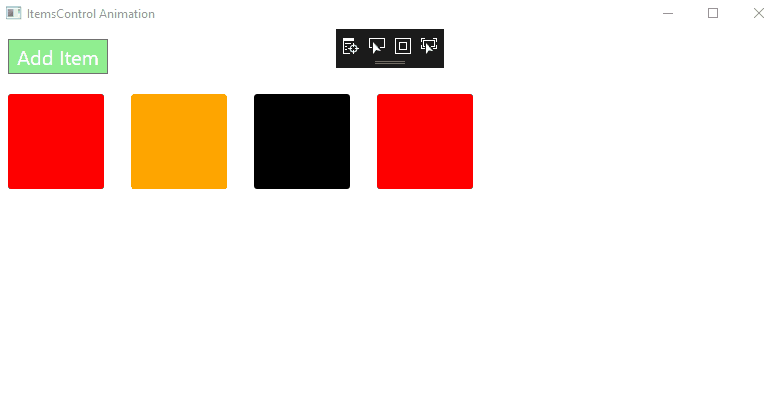
Below is the quick view of what will we going to achieve within this tutorial.
We will see
1 – Wrap layout
2 – ItemsControl in WPF
3 – Observable Collection
4 – Data binding
5 – Running
Let’s get started.
First, we need to create a new application in Visual Studio with the WPF template. I am using Visual Studio 2017.
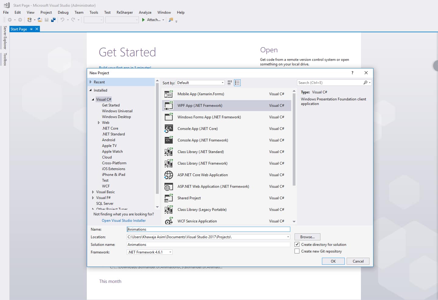
You can name it anything, I did Animations. Click OK Project has been created.
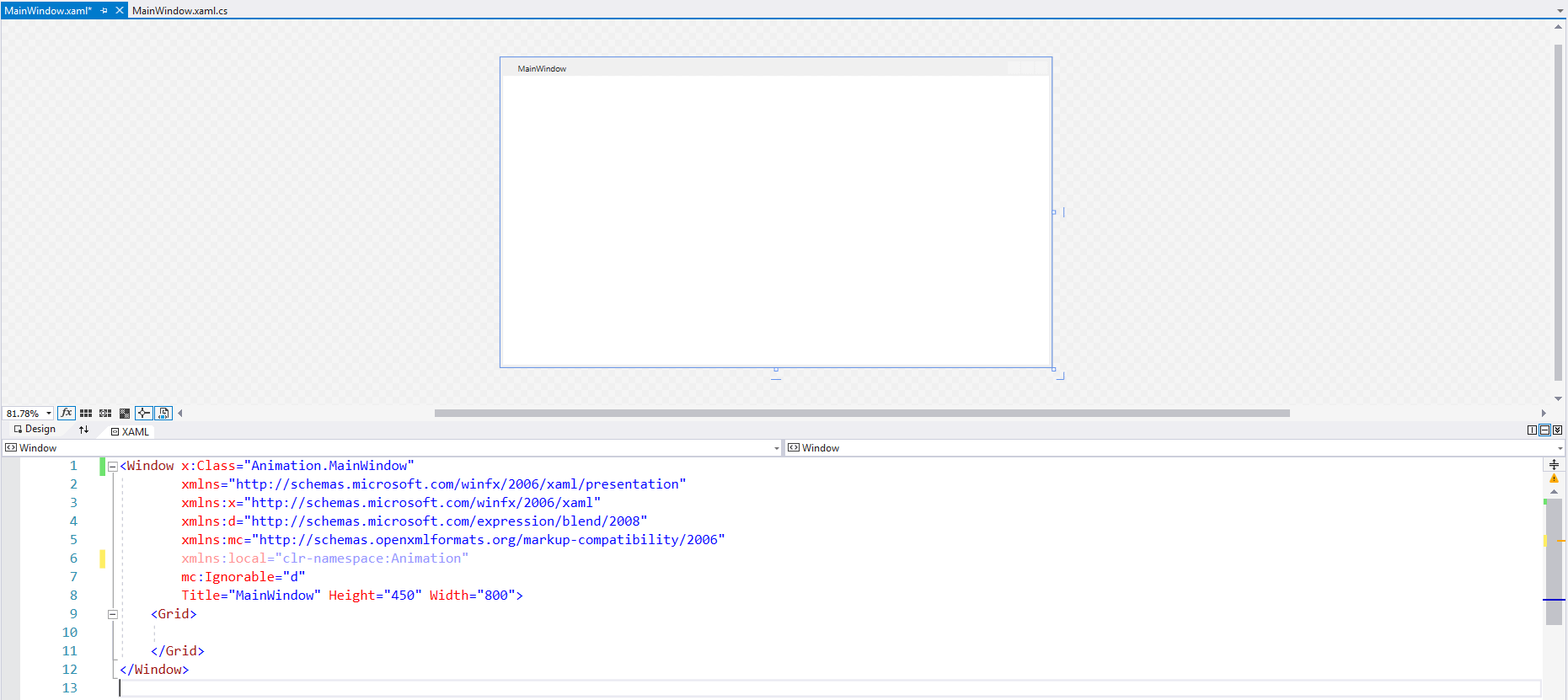
You will see something like this.
An empty form with predefined XAML.
Adding a button
Add a button with text within the MainWindow Grid.
            <Button Width="100" Height="35" Margin="10" Background="LightGreen"
                    Foreground="White" FontSize="20" Content="Add Item"
                    HorizontalAlignment="Left" VerticalAlignment="Top" Click="ButtonBase_OnClick"/>
Width=”100″ and Height=”35″ are the Width and Height of the button. Background=”LightGreen” will put Background to the Button and Foreground=”White” and FontSize=”20″ will be the Foreground and FontSize of the button respectively.
Content=”Add Item” will define what content will be shown in the button. And for Horizontal and Vertical alignments we used HorizontalAlignment=”Left” and VerticalAlignment=”Top”.
ItemsControl in WPF
Add this below code under Button you have just added in the Grid layout.
<ItemsControl x:Name="ControList" HorizontalAlignment="Left" HorizontalContentAlignment="Left">
            <ItemsControl.ItemsPanel>
                <ItemsPanelTemplate>
                  <Border Margin="10,10,17,0"
                            HorizontalAlignment="Left"
                            CornerRadius="3" Width="96" Height="95" x:Name="Items">
                        <Border.Background>
                            <SolidColorBrush  Color="Red"/>
                        </Border.Background>
                  </Border>
                </ItemsPanelTemplate>
            </ItemsControl.ItemsPanel>
</ItemsControl>
What we have done is, we introduced a Border and assign its border brush to color Red. And once you run the project you will see something like this.
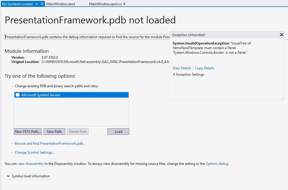
Woops! what’s this?
What this error says is, it says ItemsPanelTemplate must contain a Panel. ‘System.Windows.Controls.Border’ is not a Panel.
Means, we have introduced a template for ItemsControl’s items, and we introduce with Border which is not a Panel.
Some of the WPF panels are:
1 – StackPanel (with horizontal and vertical orientation)
2 – Grid (with rows and columns)
3 – WrapPanel(adjust panel items according to screen size)
…
Now we can replace this with StackPanel, a Grid, or with a WrapPanel. I did with WrapPanel.
So if you surround the Border with Panel control saying WrapPanel. ItemsControl will look something like this.
<WrapPanel>
                        <Border Margin="10,10,17,0"
                            HorizontalAlignment="Left"
                            CornerRadius="3" Width="96" Height="95" x:Name="Items">
                            <Border.Background>
                                <SolidColorBrush  Color="Red"/>
                            </Border.Background>
                        </Border>
</WrapPanel>
And now if you run your project again, by pressing f5 you will something like this below:
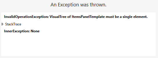
It says you can not actually put another control within your Panel.
What’s the proper way to do this is to introduce the Border control within DataTemplate of yours.
Now complete code with ItemsTemplate will look like this.
<ItemsControl x:Name="ControList" HorizontalAlignment="Left" HorizontalContentAlignment="Left">
            <ItemsControl.ItemsPanel>
                <ItemsPanelTemplate>
                    <WrapPanel Orientation="Horizontal" />
                </ItemsPanelTemplate>
            </ItemsControl.ItemsPanel>
            <ItemsControl.ItemTemplate>
                <DataTemplate>
                    <Border Margin="10,10,17,0"
                            HorizontalAlignment="Left"
                            CornerRadius="3" Width="96" Height="95" x:Name="Items">
                        <Border.Background>
                            <SolidColorBrush  Color="Red"/>
                        </Border.Background>
                    </Border>
                </DataTemplate>
            </ItemsControl.ItemTemplate>
</ItemsControl>
Running at this point will show you your button, with a border with Red-colored filled.
Observable Collection and Model binding
Now what we need to do is to, on button click we need to add a colored box each time in the wrap panel. Everything is setup we just need to create a Model for it, create an Observable collection(he will look into if collection updated or not) and bind to our View.
On your MainWindow.xaml.cs you can create a Model with simple one Brush property.
public class BoxViewModel
{
        public string Brush { get; set; }
}
Once you create the model, what you have to do is Introduce an ObservableCollection property in the MainWindow.xaml.cs class.
....
private ObservableCollection _viewModelMyList;
        public ObservableCollection MyList
        {
            get
            {
                if (_viewModelMyList == null)
                {
                    _viewModelMyList = new ObservableCollection();
                }
                return _viewModelMyList;
            }
}
....
If you have noticed above we gave our ItemsControl a name x:Name=”ControList”. We bind our public collection object MyList to it in the constructor of our MainWindow.xaml.cs
....
public MainWindow()
{
            InitializeComponent();
            ControList.ItemsSource = MyList;
}
....
It says each time you add BoxViewModel object in the MyList the ItemsControl on the view get’s updated.
Now we have to update our MyList each time the Add Item click event fires. We introduce the Click event of the button with the following code.
....
private void ButtonBase_OnClick(object sender, RoutedEventArgs e)
        {
            MyList.Add(new BoxViewModel
            {
                Brush = "Pink"
            });
        }
....
I am adding a single Pink color each time to make it very simple for now.
Now we have an ObservableCollection and a click event to update the collection from code behind.
If you run the project at this moment, you will see nothing except a red-colored box. No click event is doing anything.
Why? because we haven’t bound our List to the Brush property of our border control yet.
....
<Border.Background>
<SolidColorBrush  Color="{Binding Brush}"/>
</Border.Background>
....
Changing SolidColorBrush property to this above will bind it to your model we have attached with ItemsControl named ControlItem.
Now you will be able to see a Pink colored box each time you click a button.
But where the heck is the animation?
Animation in ItemsControl
....
            <Border.RenderTransform>
                  <TranslateTransform X="30"/>
            </Border.RenderTransform>
            <Border.Triggers>
                <EventTrigger RoutedEvent="Loaded">
                    <BeginStoryboard>
                        <Storyboard>
                            <DoubleAnimation Storyboard.TargetProperty="Opacity" To="1" Duration="00:00:00.6" />
                            <DoubleAnimation Storyboard.TargetProperty="(RenderTransform).X" To="0" Duration="00:00:00.4" />
                        </Storyboard>
                    </BeginStoryboard>
                </EventTrigger>
            </Border.Triggers>
....
This above will animate our box from left to right. within 0.4 seconds. If you want to go from Bottom to Up. Change the with
And also to
Now if you run your project, and click the button you will animated box will come from left to right. You can play with animation speed, opacity, size of it, and many more.
I gave you a walk through simple animation. One can add more animations in it according to his requirements and will.
Thanks 🙂 Drop your comment and if you hate the way I have explained this. Drop your anger below. I will try to improve myself.
Happy codding 😉